
APPEARANCE IS EVERYTHING, DESIGN IS THE FIRST STEP TOWARDS YOUR COSTUMERS.
Websites, applications, ads and products are all competing for the consumers’ attention generating a tremendous noise. It is near impossible to stand out from the crowd without a proper, unique design.
UI & Functional design
Design works best when it is a natural part of your platform’s user interface. We are not just after the look that stands out the most, we create designs that helps your user interactions in an organic way, enhancing your website’s or mobile application’s user experience to the max.
Catch the eye of your customers
Even the latest advertising spaces reach a tipping point, where users get used to them and learn to ignore them almost automatically. Our team can help you create those advertisement with that “X factor” that no one can or wants to ignore.

Impeccable quality
We pride ourselves in the quality of our work, as the end result says just as much about us as it does about your brand. We aim to understand your business as much as possible, to create the work that serves your goals the most.

Expertise in every field
When it comes to graphical design, we offer you the full spectrum. Websites, applications, online solutions, online or offline advertisements, package designs, branding, online or offline publications: we are your go to company. We don’t just have the tools to compete in every field of graphical work, we also have the expertise to go with it.

Your brand is what it looks like. There are no such things as unimportant or less important parts of your image.
Every little detail speaks volumes of your company or brand to your customers. We can help you modify parts, or redefine the entirety of your image to maximize your business potential.
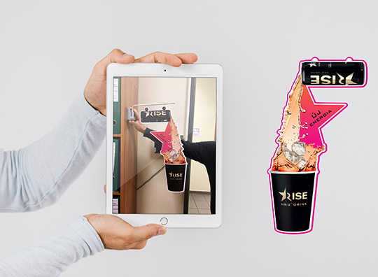
Rise
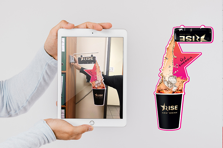
Rise
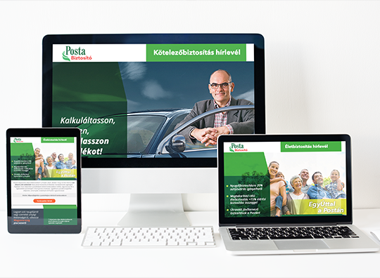
Posta Biztosító Edm
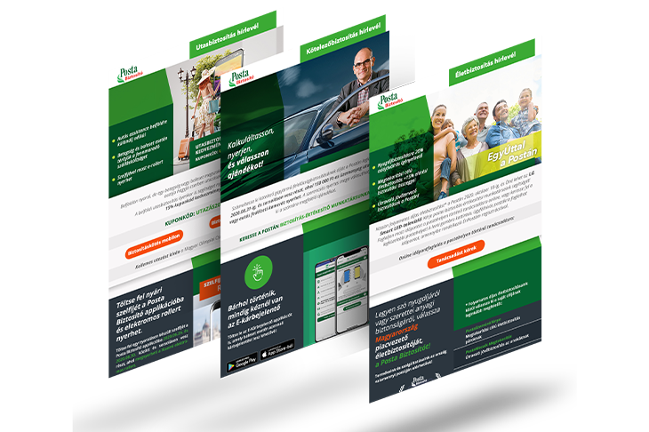
Posta Biztosító Edm
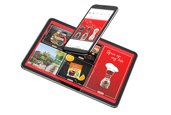
Kotányi
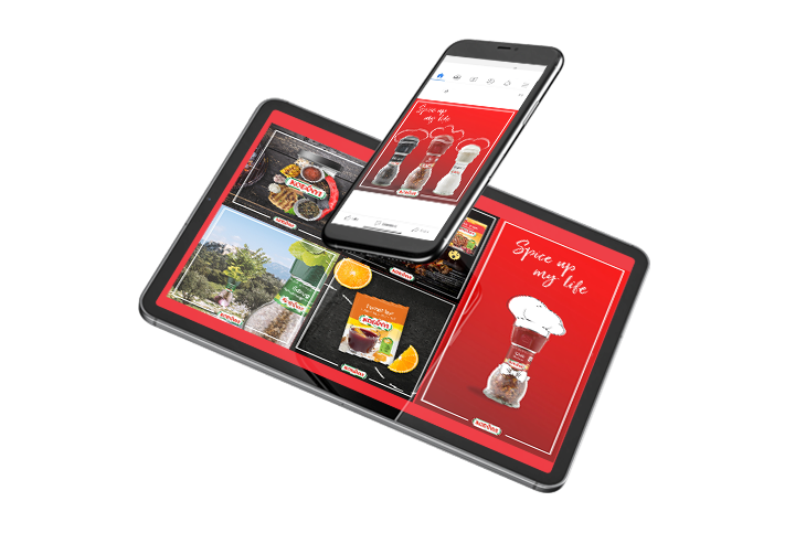
Kotányi
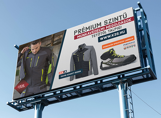
K3S
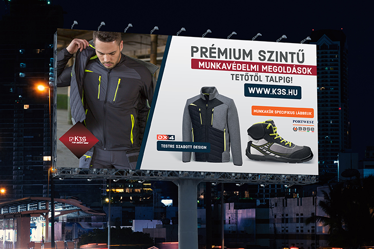
K3S
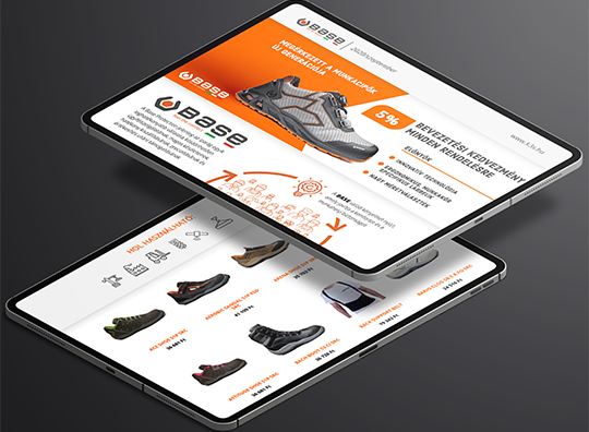
K3S
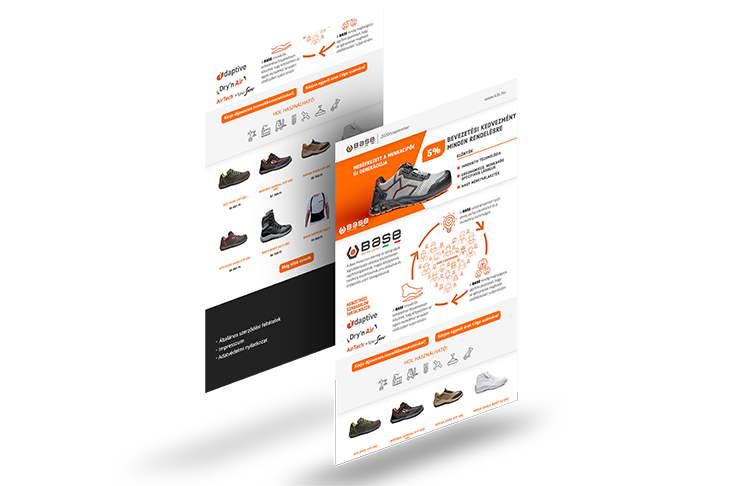
K3S
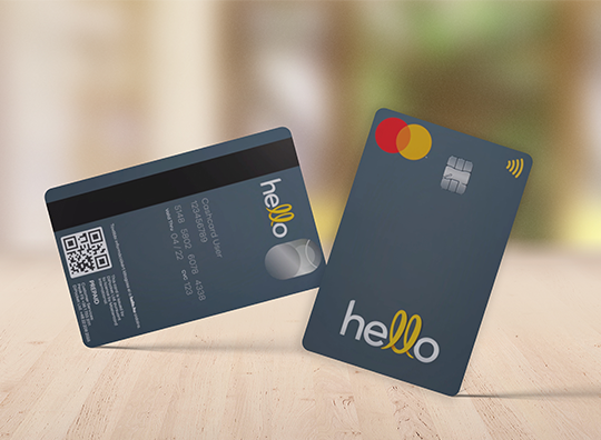
Hello Mastercard
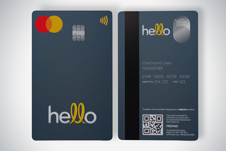
Hello Mastercard
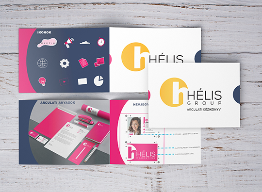
Helis
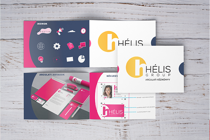
Helis
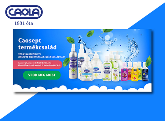
Caola
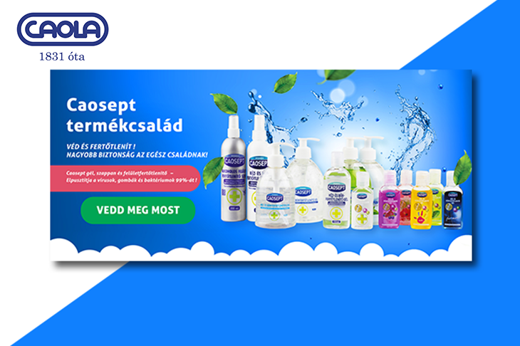
Caola
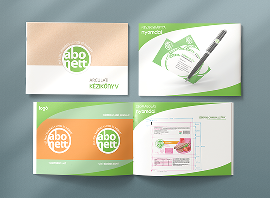
Abonett
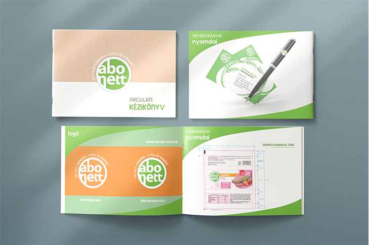
Abonett
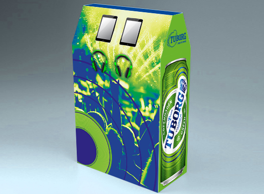
Tuborg - KIOSZK
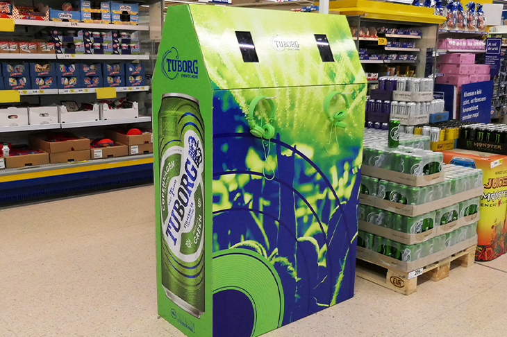
Tuborg - KIOSZK
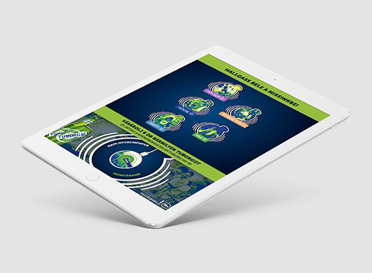
Tuborg - Application
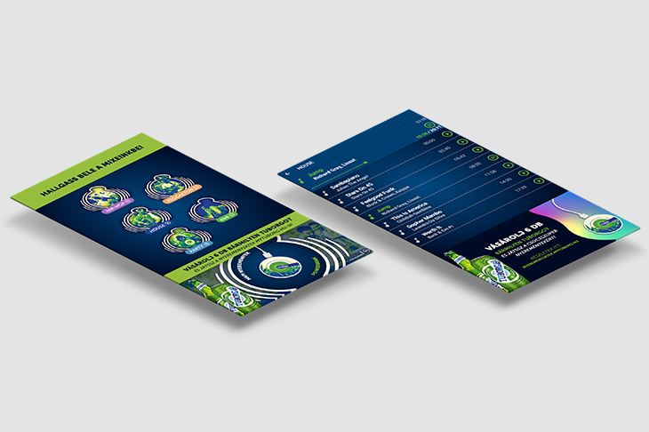
Tuborg - Application
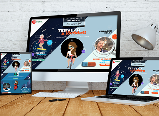
Mabisz
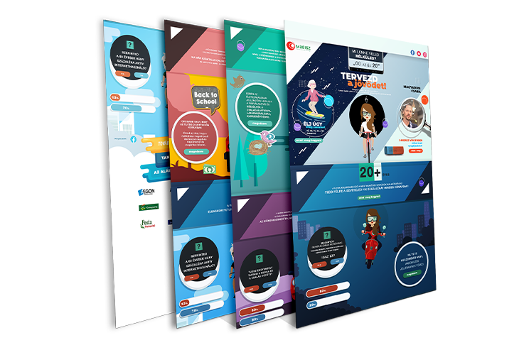
Mabisz
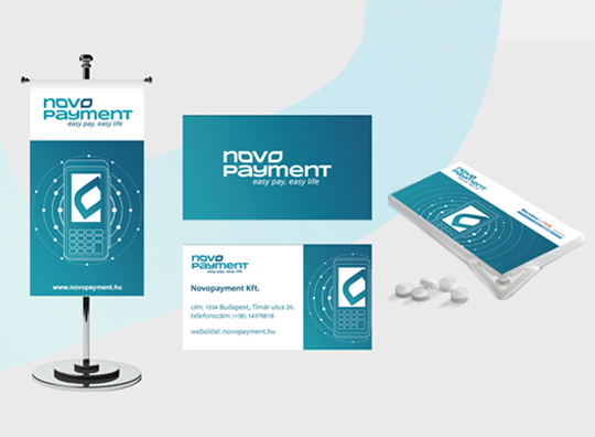
Novopayment
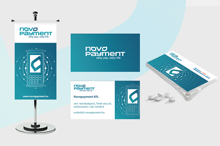
Novopayment
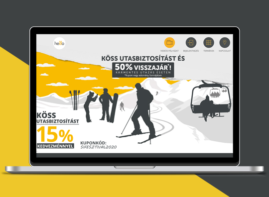
Hello Campaigns
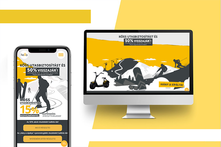
Hello Campaigns
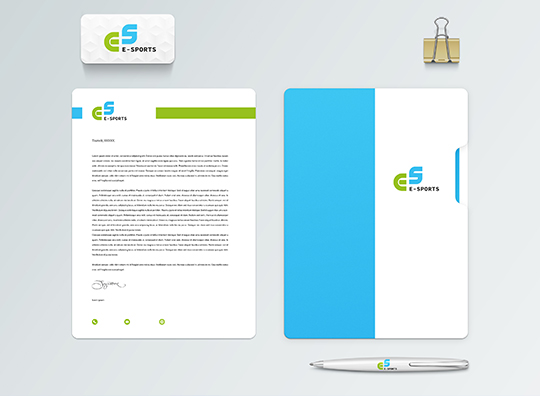
E-Sports
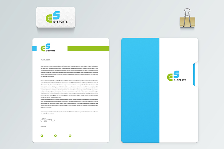
E-Sports
1664 Blanc
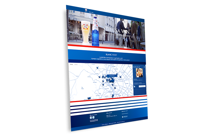
1664 Blanc
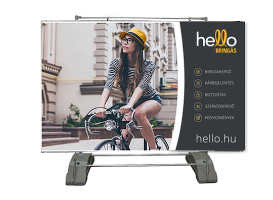
Hello Bringás rollup
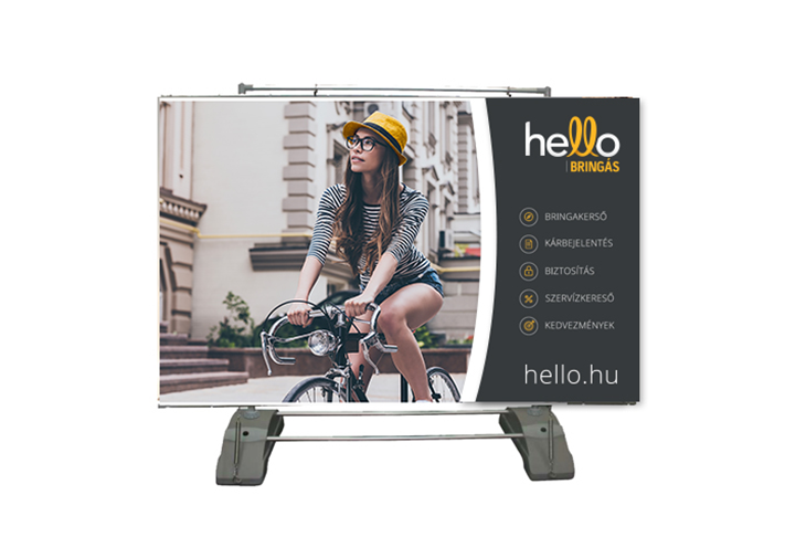
Hello Bringás rollup
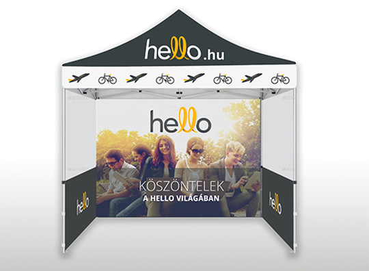
Hello Bringás tent
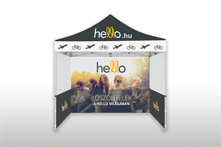
Hello Bringás tent
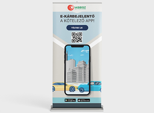
E-kárbejelentő rollup
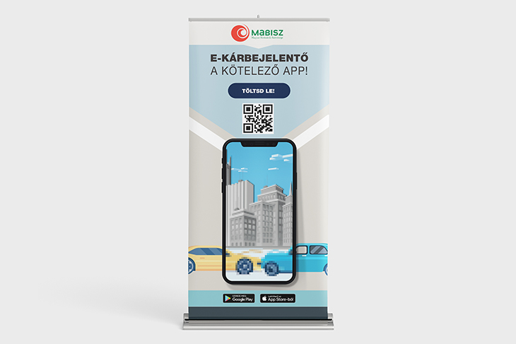
E-kárbejelentő rollup
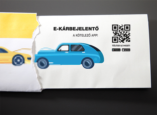
E-kárbejelentő letter
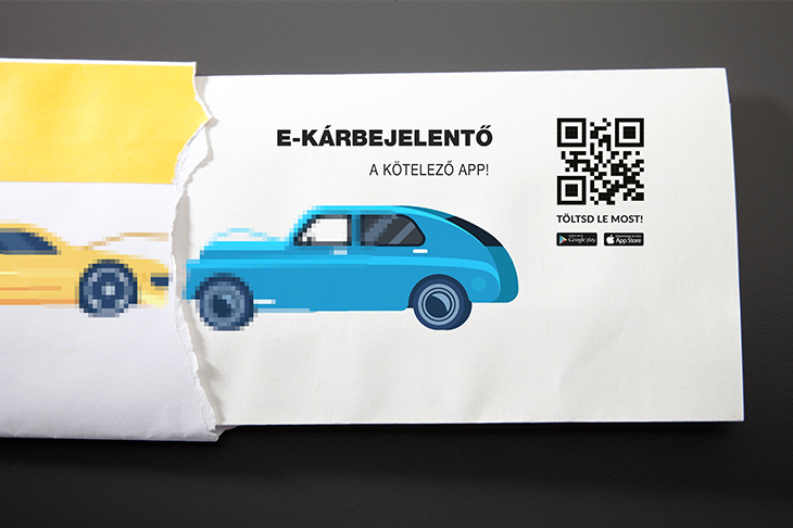
E-kárbejelentő letter
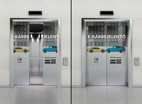
E-kárbejelentő ads
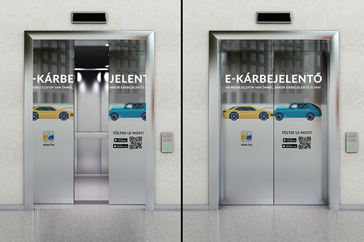
E-kárbejelentő ads
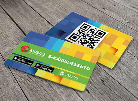
E-kárbejelentő card
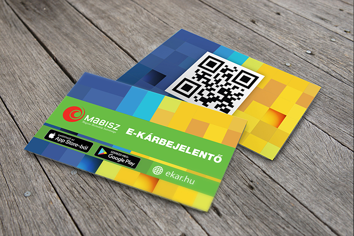
E-kárbejelentő card
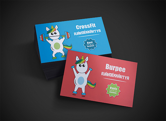
CrossFit giftcard
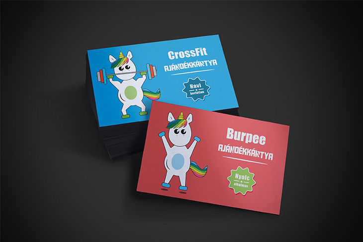
CrossFit giftcard
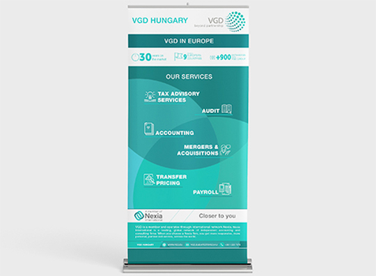
VGD rollup
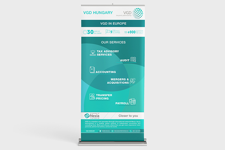
VGD rollup
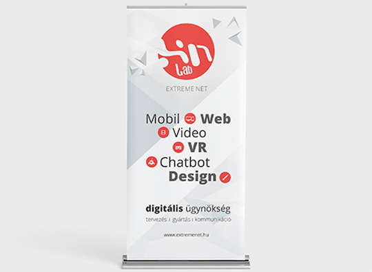
Extreme Net rollup
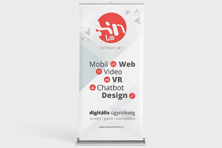
Extreme Net rollup
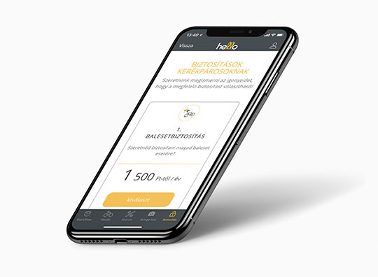
Hello Bringás mobile application
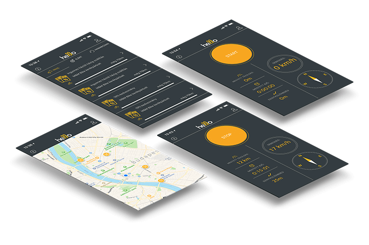
Hello Bringás mobile application
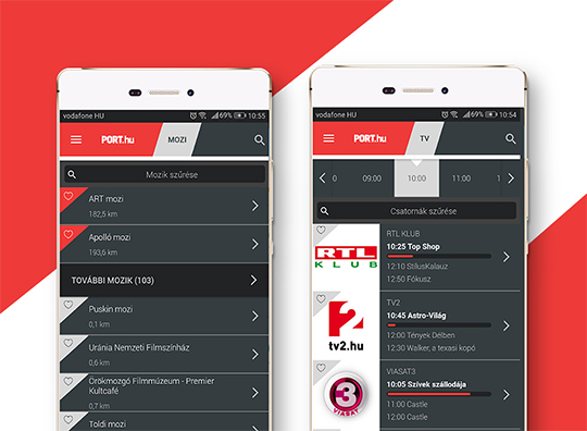
Port.hu mobile application
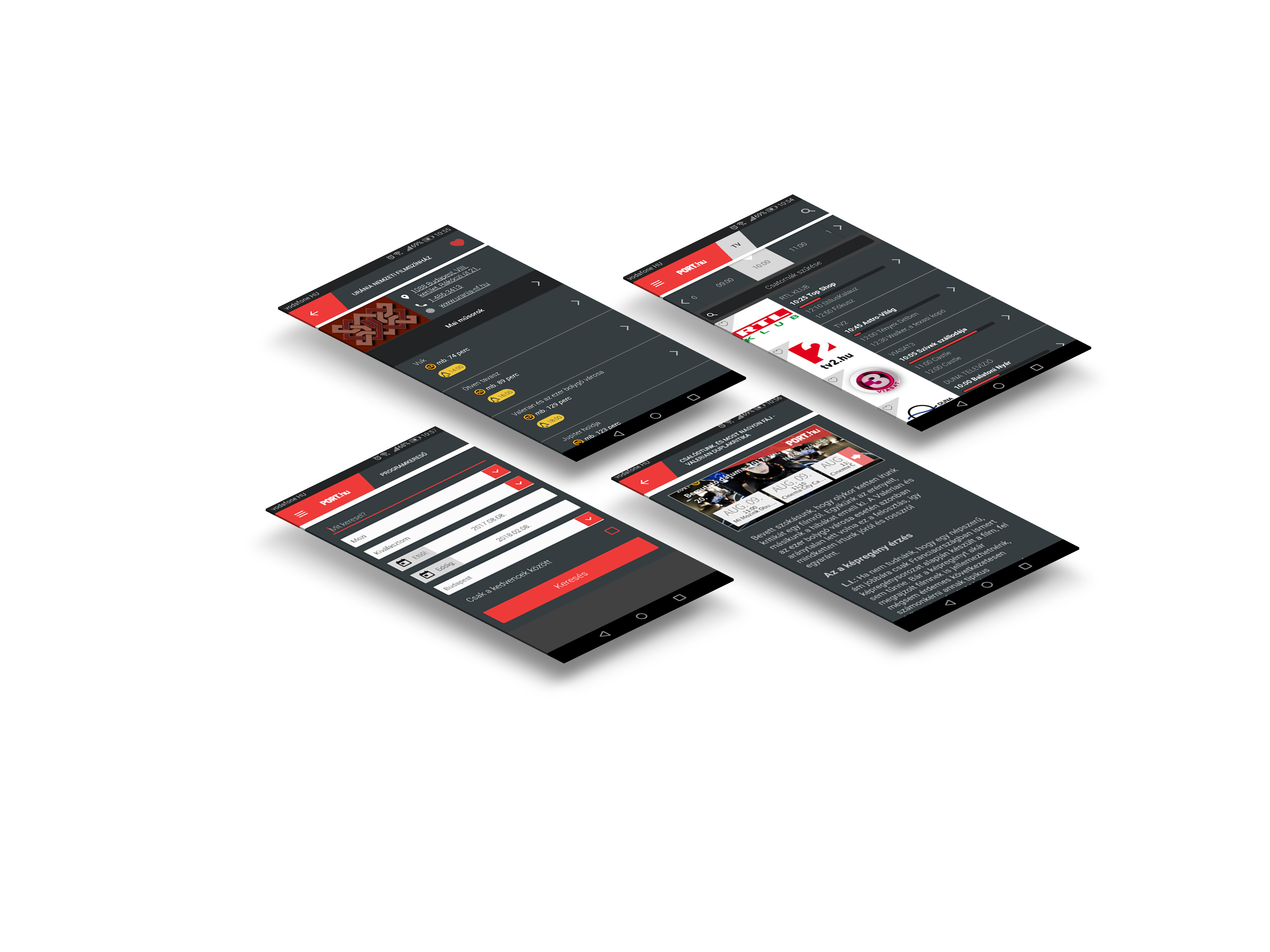
Port.hu mobile application
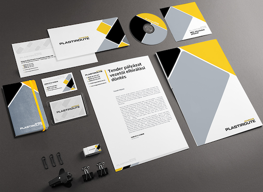
Plastiroute image
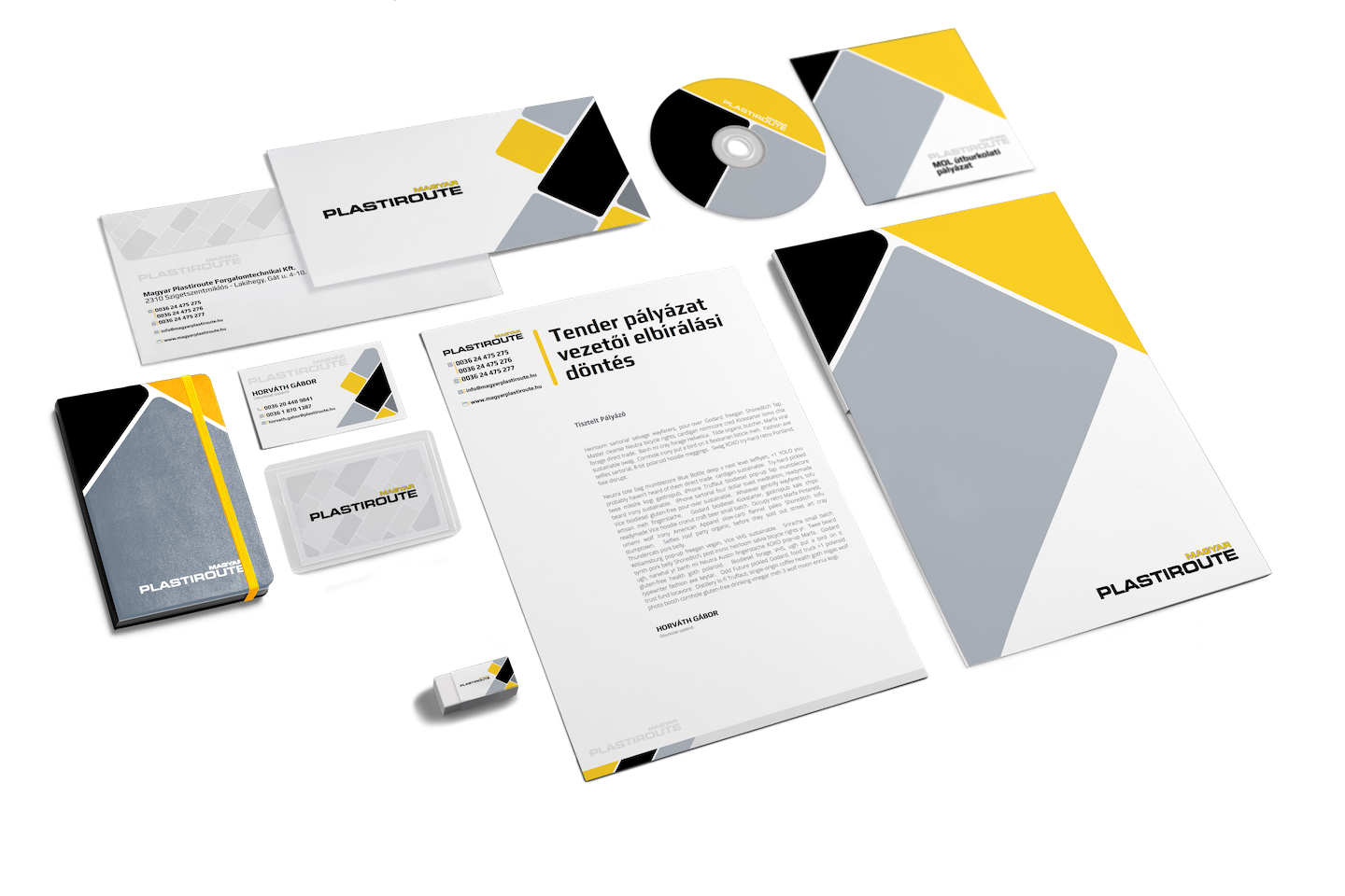
Plastiroute image
Magyar Plastiroute Ltd. – a company dealing in road traffic solutions – entrusted our agency with the full revamp of its image. As a result, we have created the company’s offline and online image elements and two complete, harmonized brandbooks.
The design had to be simple, minimalist and easy to understand, however it had to be in line with the company’s existing logo, which we couldn’t change according to the wishes of the client. We overcame this problem by focusing on standardizing the color palette and introducing the rounded tile shape as a returning element visible on every online or offline platforms.
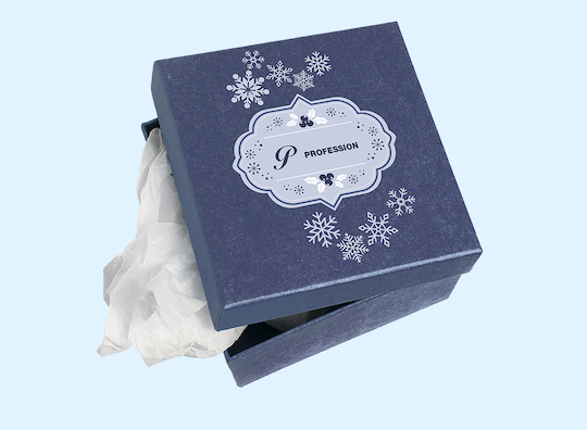
Profession Christmas giftbox
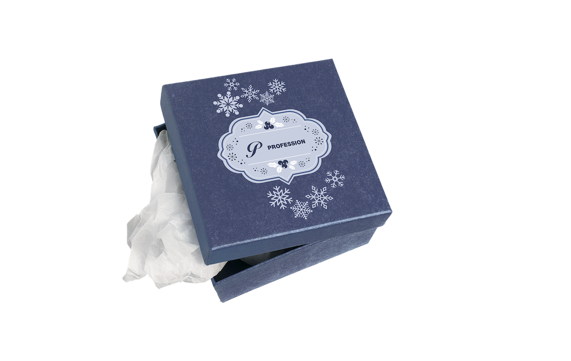
Profession Christmas giftbox
Profession.hu Ltd. needed some giftbox designs for their gift packages which they wanted to send out to their clientele for Christmas. These packages included a paper bag, a giftbox, a Christmas card and 9 different kinds of packages of specialty Christmas sweets.
Naturally, every bit of the package had to use the company’s colors, to be more exact the “profession blue” and white, besides them we also used a Christmas pattern as a recurring design element. The sweets boxes’ design provided a challenge in itself, as each of the separate boxes had to mirror the flavor of the sweets inside them, leading us to differentiate them with separate colors and logos.
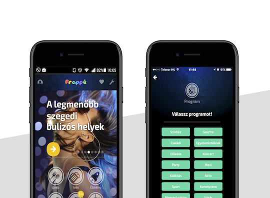
Frappé UI / UX"
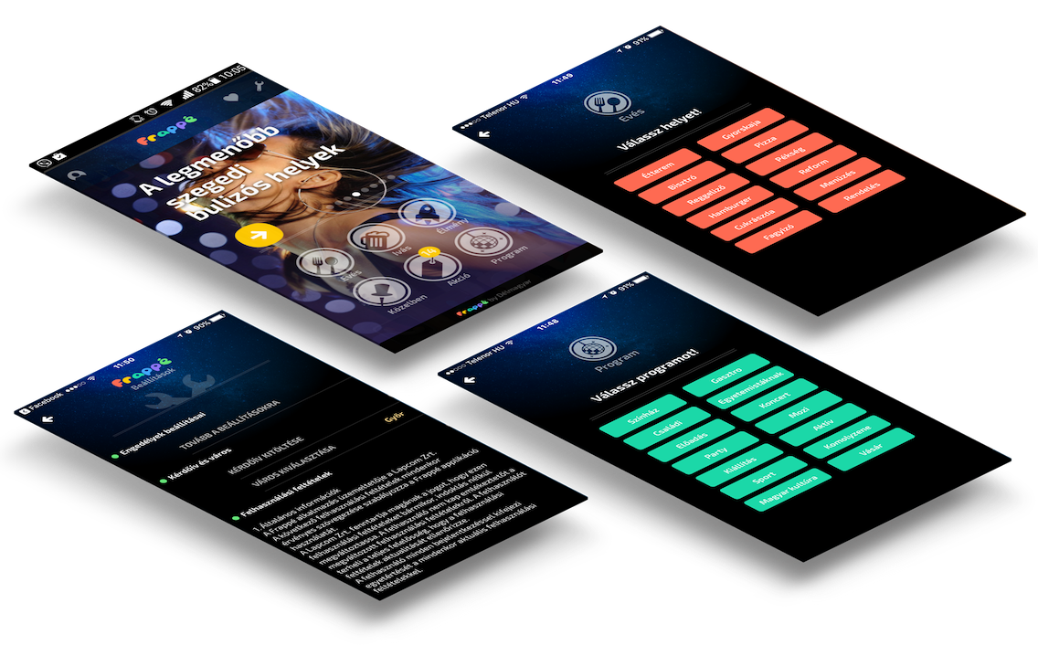
Frappé UI / UX"
“Where should I go to let off the steam in Győr or in Szeged? Which are the most exciting and trendy places? Are there any restaurants, bars, or pubs offering discounts? Are you looking for parties, programs, places, surprises or new ideas? Ask Frappé! The only leisure and night-life database updated daily for Győr and Szeged!”
Frappé is a complex, flexible and searchable database application including a comprehensive promotion tool enabling bars, pubs, restaurants to offer a wide variety of coupons or other discounts. As the application holds massive amounts of data, its user interface had to be very visual and understandable at a glance, while remaining easy to navigate.
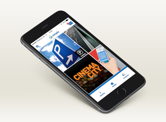
Simple UI / UX revamp
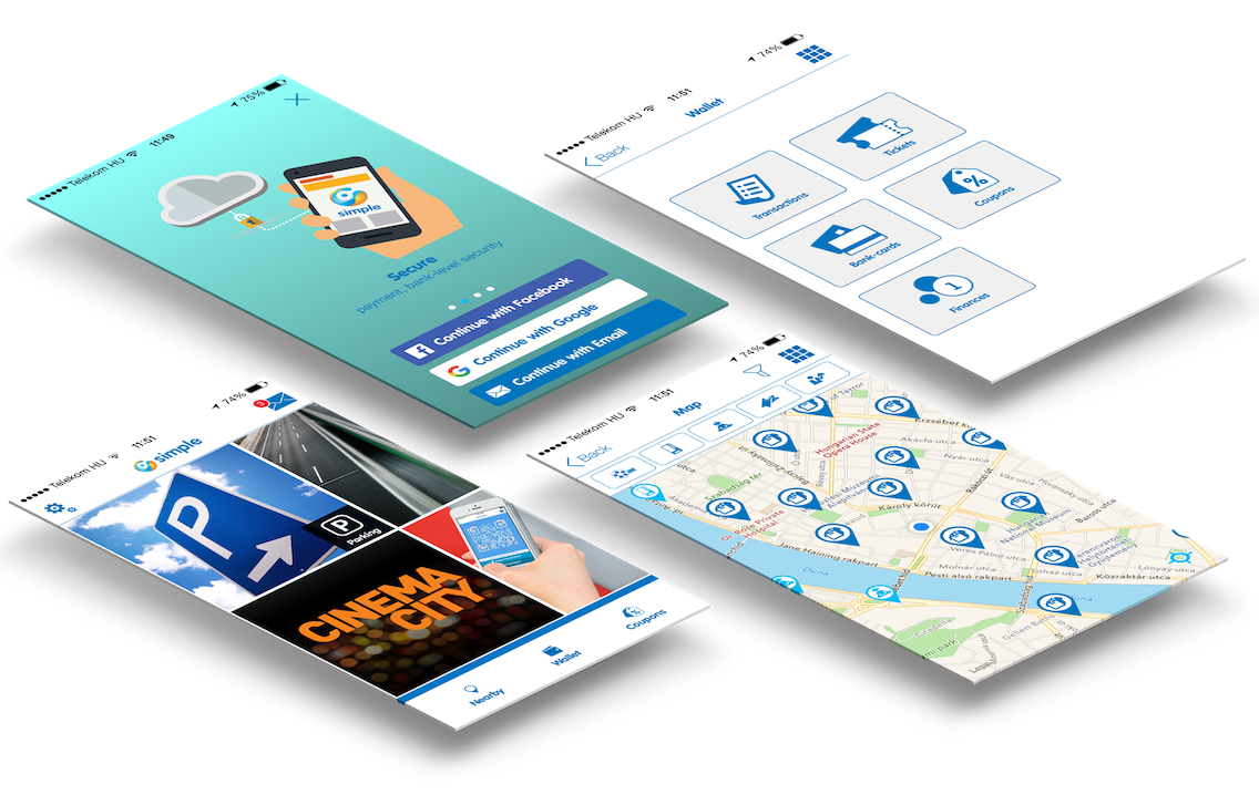
Simple UI / UX revamp
OTP Mobil gave us a chance to rethink the user interface and user experience aspects of their existing mobile application, Simple.
Simple is a modular application where each module represents a different service, making that service – like buying a parking ticket, or ordering food - easier and quicker to use. As the number of modules were growing constantly, the original UI proved to be insufficient and the application became chaotic, users were keep getting lost while trying to navigate the application. As we couldn’t touch the basic user processes, we focused on providing a flexible UI framework enabling the management of the common points of the different modules, and a seemingly unlimited space for further expansion. For the modules, we created a simplistic, modern, minimalist design and straightforward navigation processes according to the differences of Android and iOS systems. By this, we created a standard which were easy and quick to apply to future modules.
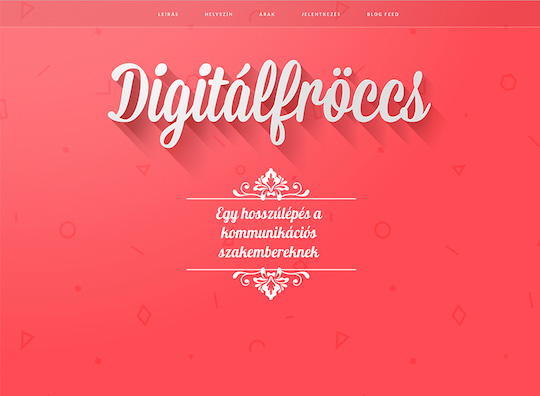
Digitálfröccs website
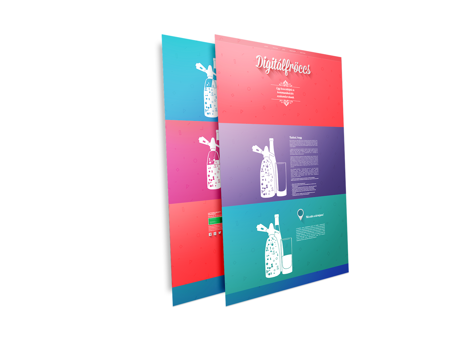
Digitálfröccs website
We’ve created Digitálfröccs („DigitalSpritzer”) workshop for company decision makers to be able to keep in step with the latest developments of digital communication. During these highly irregular workshops we basically introduced the latest digital tools, possibilities and some basic know-how but instead of presentations we used loosely constructed, comfortable conversations while enjoying some refreshments.
The whole administration process was conducted through a simple, but attractive website, which used a soda-water siphon and a glass main design element as a reference to the name of the workshop. This element changes dynamically according to the direction of the user’s navigation.
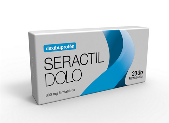
SERACTIL DOLO PACKAGE PLANS
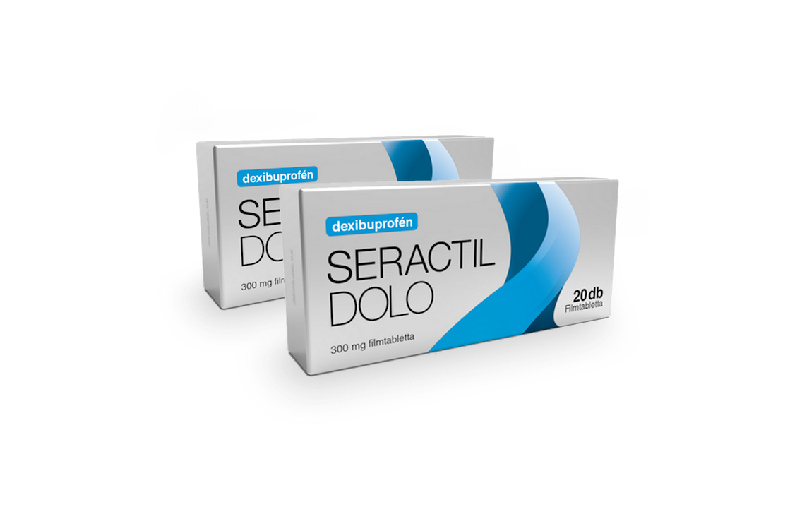
SERACTIL DOLO PACKAGE PLANS
International pharmaceutic vendor Sager Pharma needed package designs for its new headache pain relief drug, Seractil Dolo.
It had to be simple, modern and in harmony with the company’s image. We’ve created several distinctive versions, of those three made it to the final round and ultimately the silver-metallic design was selected for the product.
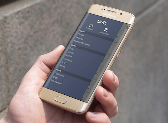
HÍR TV MOBILE APPLICATION
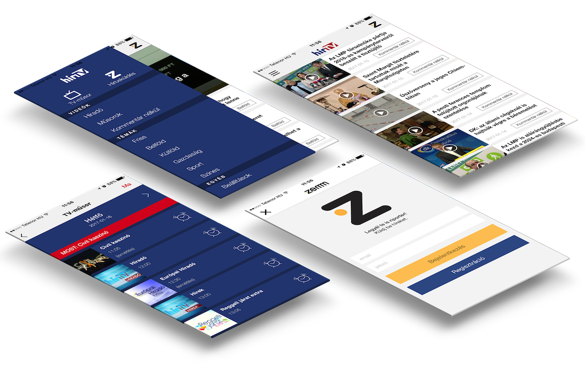
HÍR TV MOBILE APPLICATION
At first glance this application serves as a classic news platform, however by digging deeper in the functionality, one can soon realize that it’s more of a mobile extension of the popular news channel of a mobile extension of the popular news channel with tons of video content and additional information about the shows.
Our agency was entrusted with the modernization of the application, however the main focus was on design. Besides the refining process of the existing design, we also had to harmonize the appearance of the new functions with it.
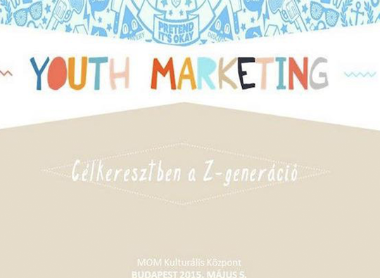
YOUTH MARKETING SITE
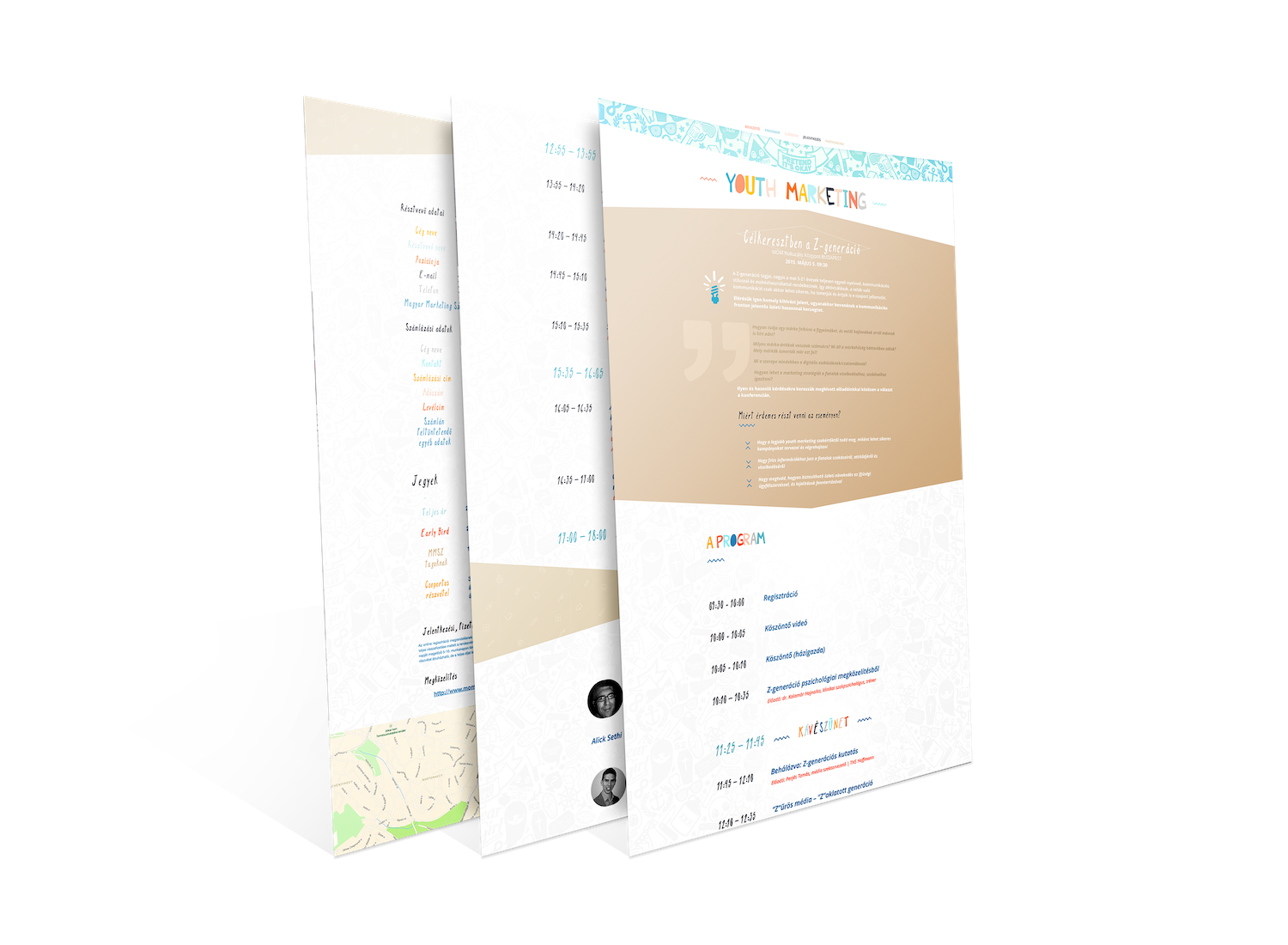
YOUTH MARKETING SITE

SZÜKSÉGE LENNE EGY SZAKÉRTŐI CSAPATRA A DESIGN STRATÉGIA KIALAKÍTÁSÁHOZ?
A már meglévő koncepció végrehajtásához keres megbízható partnert? További fejlesztőkre lenne szüksége egy futó projektjéhez? Forduljon hozzánk bizalommal!
AWARDS

Országos KKV Marketing díj

Kreatív Mediadesign 2014 Shortlist Web Alkalmazások kategória
Simple Mobilalkalmazás


„Website of the Year 2018” Special Prize in Brandsite Category
Sága - Ahogy én szeretem

Hungarian Marketing Associaton
Mabisz - Education campaing Influencer campaing

Hungarian Marketing Associaton Ambassador of Marketing Special Prize - 2019
Hungarian Marketing Associaton Marketing Diamond Award 2019 6 awards

Hungarian Marketing Associaton Marketing Diamond Award 2018 3 awards

Hungarian Marketing Associaton Marketing Diamond Award 2016 5 awards in 3 categories
Hungarian Marketing Association Marketing Diamond Award 2016 Ambassador of Marketing - Special Prize

„Application of the year 2017” in Mobile Marketing Applications Category
Hello Bringás

„Website of the Year 2017” in Mobile Marketing Applications Category
Hello Bringás

„Website of the Year 2012” Special Prize in Mobile Marketing Applications Category
Aegon Angyal Pro

„Website of the Year 2013” Special Prize in Mobile Marketing Applications Category
Napi Sorsjegy

„Website of the Year 2014” Quality Prize in Mobile Marketing Applications Category
MNO mobile app

„Website of the Year 2014” „Application of the year 2014” in Mobile Marketing Applications Category
OTP Simple

